Folded Programme or Wall Poster: Two Jobs for Film Print
Compare a folded cinema programme with a wall poster to choose print that serves a screening, catches passing attention and earns a place in a collection.
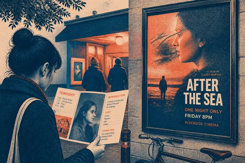
A folded cinema programme helps one viewer carry details of a particular screening; a wall poster has to catch the eye of someone who may not yet know the film. That difference shapes everything from wording and layout to where each object belongs. If you are designing, displaying or collecting film print, judge it by the job it performs before comparing its look.
Start with the encounter
A programme meets its reader at close range, often after a ticket has been chosen or a seat found. It can afford small type, several panels and information that rewards a pause: a cast list, screening notes, a running order or a short piece about the venue’s presentation.
A poster meets people in motion. Its title, image and principal credit need to register before a passer-by moves on. Supporting details can be present, but they should not compete with the central signal. The poster does not need to explain the whole event; it needs to make the film legible and invite a closer look.
This is not a contest between intimate and impressive design. The objects answer different questions. A programme asks, “What am I seeing tonight?” A poster asks, “What is this, and should I stop?”
Plan a screening week
Use the week around a screening to make decisions in order. This keeps the programme specific to the event and the poster readable in its actual setting, rather than treating both as interchangeable publicity.
- Early in the week: Write down what a visitor needs at the venue and what a passer-by needs to notice. Put screening time, venue and practical notes in the first group; put film title and the strongest identifying image in the second.
- Before the design is fixed: Choose the programme’s fold and panel order. Make sure the cover still reads as a clear invitation when the programme is closed, then place detail inside where a reader can settle in.
- Midweek: Review the poster from the distance and angle at which people will encounter it. Check that title and image remain distinct from surrounding notices, glass reflections and nearby signage.
- Before printing: Read every programme panel in sequence, including what appears after each fold. Separately, inspect the poster as a single composition; information that is easy to find in a programme can become visual clutter on a wall.
- On screening day: Put programmes where ticket-holders can take one without interrupting the entrance flow. Place the poster where it can do its public-facing work, not where a queue or door hides its main image.
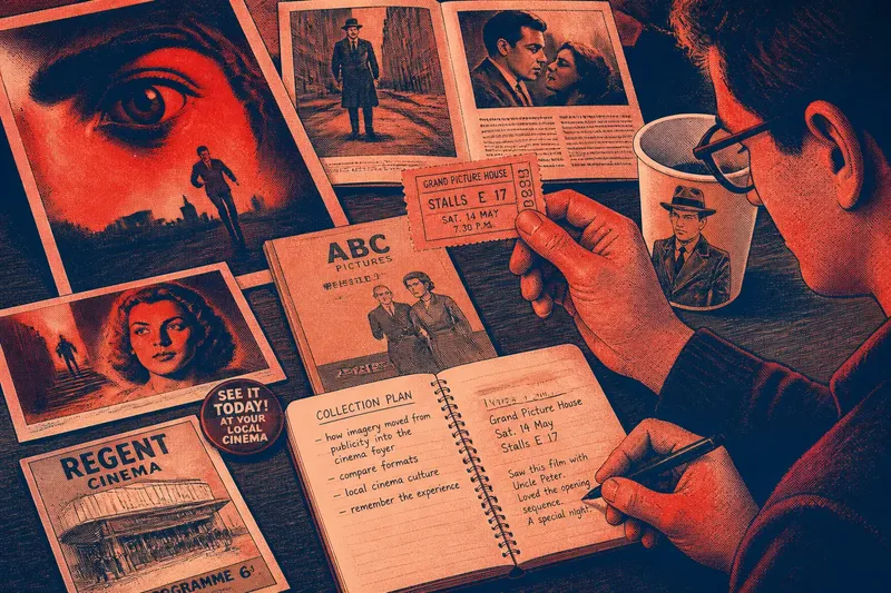
- After the screening: Keep a programme if it records details that would otherwise disappear, such as a special introduction or a one-night running order. Keep a poster when its design or condition has lasting interest to you, rather than simply because it was used to advertise the event.
The sequence matters because context can change the design. Say you are preparing a late screening in a small repertory cinema. You make the programme carry the precise start time and a note about a short pre-film introduction, while the poster gives the title and a striking still the clearest space; a visitor can then find event details inside and recognise the film from across the street.
Make each format work
For a programme, think in panels rather than treating the folded sheet as a miniature poster. The cover can establish the screening’s identity; an inside panel can hold the schedule or notes; a final panel can carry venue information. Keep the reading order obvious when the sheet is opened, and do not let a fold split a name or sentence awkwardly.
Use a poster’s limited viewing time to establish hierarchy. A bold title and a distinctive image can do more than a crowded field of credits. If the poster advertises a specific screening rather than the film generally, add the event details in a secondary position that remains readable without displacing the main image.
Material supports the job, too. A programme is handled, opened and sometimes taken away, so paper that folds cleanly and text with comfortable contrast matter. A poster is seen at a distance and may be mounted; consider glare, the surface behind it and whether the edges will obscure any essential wording. Follow the printer’s specifications for files and paper, and the venue’s instructions for mounting or display.
What is not worth the effort is forcing both objects to carry every detail. Repeating the full programme on the poster makes its message harder to catch; reducing a useful programme to a decorative cover wastes the chance to serve the person already attending.
Choose by use, not size
Size can mislead. A large poster is not automatically more informative, and a small folded programme is not automatically more personal. The better question is whether the format suits the reader’s moment: a glance in public or a pause in hand.
For a cinema, a programme can become a modest record of how one screening was shaped. For a designer, its folds offer a sequence; for a collector, its event-specific details may be the point. A poster often works as a durable visual identifier, but only if its image and title remain clear outside the context of the screening.
Questions to settle?
What belongs in a cinema programme?
Include details that help an attendee follow or remember this particular screening, such as the schedule, introductory note or relevant credits. Keep general promotional copy out if it does not help the person holding the sheet.
What makes a film poster readable?
Give the title and a recognisable image a clear order, then check them from the distance at which the poster will be seen. Keep secondary text subordinate so the first impression does not dissolve into competing blocks.
Can one design serve both formats?
A shared image or type treatment can make the programme and poster feel connected, but each layout needs its own hierarchy. Reflow the content for the format instead of shrinking a poster design into a folded sheet or enlarging a programme panel unchanged.
Which should I keep after a screening?
Keep the object that preserves something you value: a programme’s event details or a poster’s visual identity. If neither adds useful context or pleasure to your collection, there is no need to save both.
Keep the distinction visible
When you compare a folded programme or wall poster, start with the audience’s attention and the place the print will occupy. The programme should reward someone who has stopped to read; the poster should communicate before that person decides to stop. That simple distinction makes it easier to edit copy, choose placement and decide what deserves to be kept.